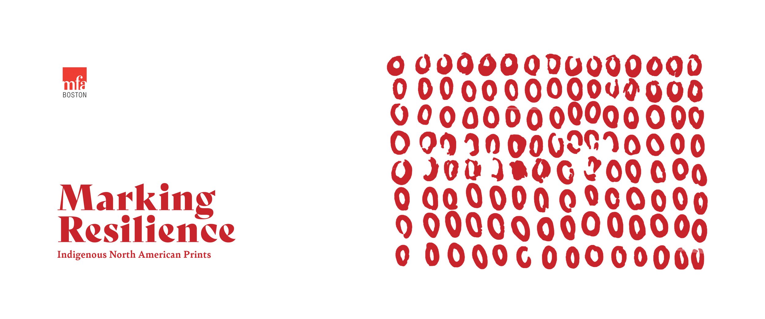
MARKING RESILIENCE
Resilience often manifests in work by Indigenous North American artists, for example in its content or simply by increasing visibility to combat erasure in representation. Some Native artists have used the collaborative medium of printmaking as a way of reclaiming their histories and addressing the challenges their communities face today.

The exhibit that I visited was the “Marking Resilience” exhibit at the MFA. The exhibit is a collection of prints from the indigenous people of North America. There is a variety of lithographs, screen prints and monotypes of varying subject matter, mostly relating back to the heritage of the people. I was really drawn to the graphic qualities of the prints and impressed by the colors and compositions. There wasn’t anything available at the exhibit to interact with, so it seemed like most people didn’t spend a very long time there. I think the exhibit would benefit from adding some interactive elements to keep people engaged for longer. These are the initial sketches for those ideas.
After visiting the exhibit, I created multiple personas based on the types of people that I observed while there. There were people from many different cultural backgrounds and demographics. I focused on “Michael” for this particular exercise. He is an artist who’s main goal after leaving the exhibit is finding out more information about the artists who’s work he admired.
One of the first things that I noticed was a lack of information regarding the artists or their work in clear spaces for much of the prints on display. This week was mostly refining of the initial proposal ideas from last week. After visiting the exhibit at MFA, my initial proposal mainly focused around expanding on the existing works and finding an easier way for the individual artists to be discovered. I feel that if there were some better ways for people attending the exhibit to find out more about the artists, the exhibit would feel less two dimensional and be overall more enjoyable.
The way finding at the museum leading to the exhibit would be one easy way to lead the attendants there in a much easier and more direct way than currently exists. There are many natural geometric shapes existing in the prints already and using some of those shapes as paths that would exist on the floors or walls leading to the exhibit would benefit greatly for everyone attending. As the exhibit is at the moment, it is tucked away on a lower floor in the museum and had I not been walking the length of the building, I may have never discovered it.
The social media for the exhibit would also mirror the exhibit itself while working as a small scale, simplified version of the full website. Full posts on the Instagram page could include deep dives in to the artists backgrounds as well as tidbits from their history and the history of the printing process that they used. The pictures posted to stories could be updated more regularly and cover more time sensitive materials regarding artists upcoming shows or any sort of news regarding the tribes of North America.
For the web aspect of the four deliverables, I think the exhibit would benefit from some more direct studies of the individual artists. I think the existing website looks fairly nice as is but doesn’t lead the user to learn anymore about the artists or the printing itself. The website layout sketch that I made this week was similar to the existing layout but would add to the layers within the homepage that would enable the user to dive deeper into the backgrounds of the indigenous North American artists. The website visually would mirror much of the typographic language as well as shapes from the exhibit itself.
The AR layer of the exhibit would also exist through peoples phones. My initial idea is that the prints on display could be scanned with people’s smartphones and the UI on the screen would interact with what the attendants are seeing in real time. It could come across as talking bubbles or images on the screen to further add another dimension to the artwork in the exhibit.
I brought the initial web sketches on to the computer and tried to make a site that felt cohesive and easy to navigate like the exhibit itself. The layout is simple and aims to give a closer, more in depth look at each individual artist. The main page acts as a slider that drops down to give a brief bio on the artist who’s picture you select. The secondary page brings up one of the works from the given artist along with a youtube video where you can explore the process behind making any given print.
The social media page for the exhibit is an Instagram that is multi-layered. The final digital version is much like the initial sketches of the ideas while aiming to keep the same look and feel of the website and exhibit itself. It is easily navigable and like the other components, has the artists in the forefront.
For the final mockup of the way-finding aspect of the project, I felt like outdoor signage would benefit the exhibit more than anything within the museum itself. The MFA has a very set visual aesthetic and I didn’t think it would be realistic to put anything out of place on the floors or walls. These signs were created with the hopes of drawing attention to the exhibit throughout the city of Boston, while also paying visual homage to some of the artists that are featured. The MFA logo leads the users to where they can learn more.


